TheDeveloperBlog.com
C-Sharp | Java | Python | Swift | GO | WPF | Ruby | Scala | F# | JavaScript | SQL | PHP | Angular | HTML
HTML picture Tag
HTML picture Tag with html tutorial, tags, anchor, img, div, entity, textarea, marquee, p tag, heading tag, h1, h2, table, formatting, attribute, elements, ol, ul, Input Types, block element tag, inline element tag, html tags, phrase tag, head, body, form, lists, symbols etc.
HTML <picture> tagHTML <picture> tag is used in responsive web designing where we need to load the different images based on their viewport, height, width, orientation, and pixel density. The <picture> tag contains one or more <source> elements and one <img> elements. According to the viewport, the matching image will be loaded from different <source> tag, and if no source contains the matching image, then the default image present in <img> tag will be displayed on the browser. This tag is a new tag in HTML5. Syntax<picture> <source srcset="" media=""> <img src=""> </picture> Following are some specifications about the HTML <picture> tag
Example
<!DOCTYPE html>
<html>
<head>
	<title>Picture Tag</title>
	<style>
	body{
	    text-align: center;
                   }
	   p{
	     font-size: bold;
	     font-size: 20px;
	   color: green;
                    }
	</style>
</head>
<body>
<h2>Example of picture tag</h2>
<p>Resize the page to see the different versions of the images at different viewports, and as per viewport image will be automatically changed.</p>
<picture>
    <source srcset="download1.jpg" media="(min-width: 750px)">
    <source srcset="pic2.jpg" media="(min-width: 450px)">
    <img srcset="rose.jpg" alt="default image" style="width: auto;">
</picture>
</body>
</html>
Output: 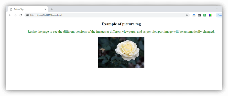
Attribute:
Tag-specific attributes:
Global attribute:HTML <picture> tag supports the global attributes in HTML. Supporting Browsers
Next TopicHTML pre Tag
|


 Chrome
 IE
IE Firefox
 Opera
Opera Safari
Related Links:
- Learn HTML Tutorial
- HTML var Tag
- HTML wbr tag
- HTML label tag
- HTML legend Tag
- HTML link tag
- HTML dir Tag
- HTML script tag
- HTML section tag
- HTML select Tag
- HTML JavaScript
- HTML Comments
- HTML File Path
- HTML Head
- HTML Layout
- HTML tfoot Tag
- HTML th Tag
- HTML thead Tag
- HTML Layout Techniques
- HTML Responsive
- HTML Computercode
- HTML col Tag
- HTML colgroup Tag
- HTML Event Attributes
- HTML 5 Tags
- HTML Heading
- HTML Paragraph
- HTML Phrase Tags
- HTML Anchor
- HTML applet Tag
- HTML area Tag
- HTML map Tag
- Top 44 HTML Interview Questions | HTML5 Interview Questions (2021)
- HTML fieldset Tag
- HTML progress tag
- HTML Quotes
- HTML Entities
- HTML dfn Tag
- HTML Video
- HTML Image
- HTML Table
- HTML Lists
- HTML Ordered List | HTML Numbered List
- HTML Id Attribute
- HTML Iframes
- HTML center Tag
- HTML source tag
- HTML span Tag
- HTML Geolocation
- HTML Web Storage
- HTML Web Workers
- HTML Building Blocks
- HTML Tags
- HTML Attributes
- HTML Description List | HTML Definition List
- HTML Form
- HTML Form Input Types
- HTML Symbols
- HTML Style
- HTML SVG
- HTML tbody Tag
- HTML td Tag
- HTML Charset
- HTML URL Encode
- HTML Global Attributes
- HTML article tag
- HTML aside tag
- HTML Audio
- HTML del Tag
- HTML option Tag
- HTML output tag
- HTML param Tag
- HTML picture Tag
- HTML Server-Sent Event
- 500+ HTML Color Names
- HTML Unordered List | HTML Bulleted List
- HTML bold tag
- HTML base Tag
- HTML cite Tag
- HTML code tag
- HTML data tag
- HTML datalist tag
- HTML details tag
- HTML dialog tag
- HTML em Tag
- HTML embed tag
- HTML figcaption tag
- HTML figure tag
- HTML font Tag
- HTML footer tag
- HTML frame Tag
- HTML frameset Tag
- HTML header tag
- HTML hr tag
- HTML template tag
- HTML Textarea
- HTML html Tag
- HTML i Tag
- HTML input tag
- HTML ins Tag
- HTML Form Attributes
- HTML with CSS
- HTML Classes
- HTML Isindex Tag
- HTML kbd Tag
- HTML main tag
- HTML mark tag
- HTML div tag
- HTML New Elements
- HTML Google Maps
- HTML Drag and Drop
- HTML Canvas
- HTML caption Tag
- HTML menu Tag
- HTML meta Tag
- HTML basefont Tag
- HTML bdi tag
- HTML bdo Tag
- HTML big Tag
- HTML blockquote tag
- HTML meter tag
- HTML Text Editors
- HTML Elements
- HTML Formatting
- HTML abbr Tag
- HTML address Tag
- HTML acronym Tag
- HTML nav tag
- HTML noframes Tag
- HTML noscript tag
- HTML object Tag
- HTML optgroup Tag
- HTML pre tag
- HTML rp tag
- HTML rt tag
- HTML ruby tag
- HTML s Tag
- HTML samp Tag
- HTML small Tag
- HTML strike Tag
- HTML strong Tag
- HTML sub Tag
- HTML summary tag
- HTML body Tag
- HTML br tag
- HTML button tag
- HTML sup Tag
- HTML time tag
- HTML Title
- HTML tr Tag
- HTML track tag
- HTML tt Tag
- HTML u Tag